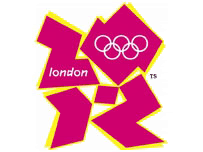
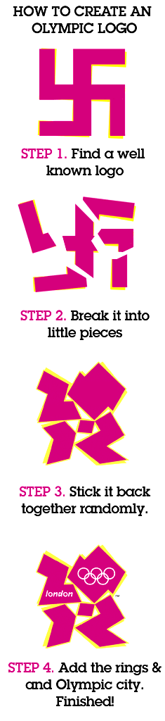
 I wondered how London came up with their new Olympic logo, which tasteful Britons tell us looks like a plate of sick. For 400,000 pounds, I'd think they could have done better, since other people submitted free alternatives that look a lot less stupid than this one. It's only recognizable as saying 2012 if you squint your eyes and bob your head a bit as if drunk, which makes me wonder if the 400K didn't go towards some fine English wine, explaining the incoherent scrawl and the vomit that served as inspiration. There is one alternative theory I like, although god knows how long it will stay up before they get an eloquent but nasty C&D letter.
Tuesday, June 12, 2007
London 2012 logo worse than breakfast at DQ
I wondered how London came up with their new Olympic logo, which tasteful Britons tell us looks like a plate of sick. For 400,000 pounds, I'd think they could have done better, since other people submitted free alternatives that look a lot less stupid than this one. It's only recognizable as saying 2012 if you squint your eyes and bob your head a bit as if drunk, which makes me wonder if the 400K didn't go towards some fine English wine, explaining the incoherent scrawl and the vomit that served as inspiration. There is one alternative theory I like, although god knows how long it will stay up before they get an eloquent but nasty C&D letter.
Subscribe to:
Post Comments (Atom)
No comments:
Post a Comment